Personal Work
This section of my portfolio is for work that I completed outside of school, for various personal projects.
This section of my portfolio is for work that I completed outside of school, for various personal projects.
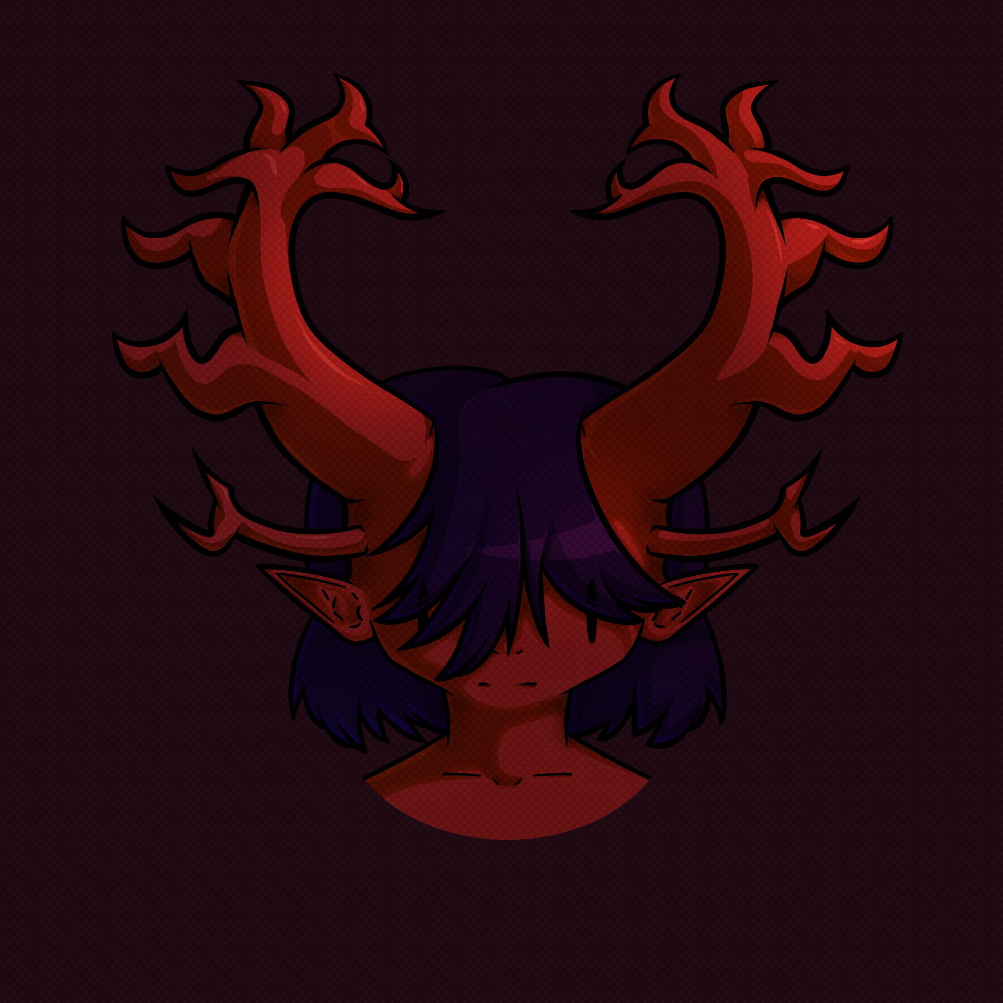
I made this illustration during summer of 2024, because I wanted to try out a new method of rendering, and because I wanted to make a new design for my D&D character, Iados Tavernier-Silcstia. More information about my process (both the rendering and the initial design process) can be found below. The new method of rendering I used was partially inspired by a webcomic called Castoff.
I am extremely proud of this drawing, as I tend to struggle quite a bit with shading/rendering, however I think it came out very well in this drawing.
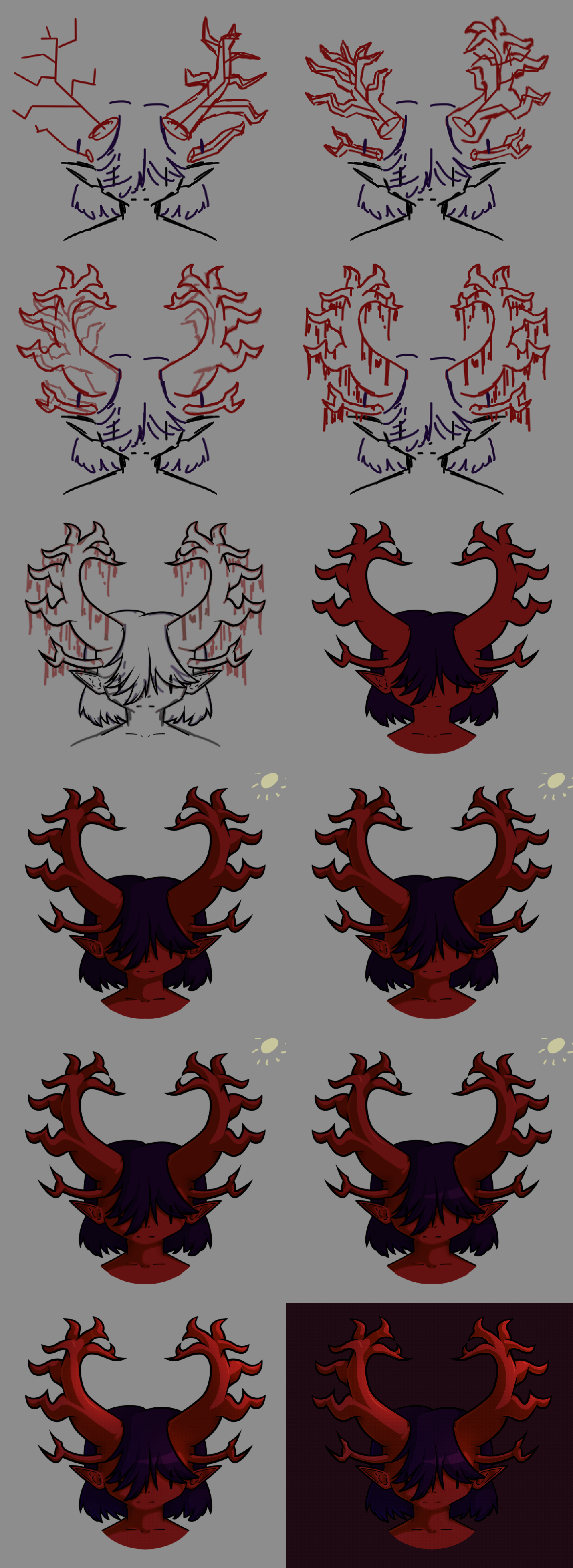
To draw Iados's horns, I started with a sketch. I had a vague shape in mind for the shapes of the horns, so I first drew a frame made out of lines. I used the mirror tool in Krita to ensure it was even on both sides. I wasn't satisfied with my first iteration of the shapes of the horns, so I tried again. On the second iteration, I used the liquify tool to stretch the horns up slightly, to make them more curved and swooping. However, the liquify tool does not work with the mirror tool, so I then (on a new layer) traced the shape of the liquefied horn, using the mirror tool. I also changed the shapes of the horn slightly in the process.
After I had finished the sketch, I scaled it (and the canvas) up, so I would have more space to work with. I then drew the lineart (again, using the mirror tool on the horns). I used the fill bucket to make the flat colours.
The first stage in the rendering was drawing the flat shadows. I drew a little representation of the sun in the top left corner (to remind me what direction the light would be coming from) and I added the flat shadows on a multiply layer. The colour of the shadows on the skin/horns was a dark yellow, and the colour on the hair was a light purple.
The next stage was adding subsurface scattering on the skin. To do this, I added a new, low opacity layer, and drew with red around the edge of the shadows on the skin. I then blurred this layer slightly. The effect is very subtle, but I think it is effective. I also added slight reflections in the shadows from the ambient light on an overlay layer, and ambient occlusion on a multiply layer. None of these things are things that I usually do when rendering, but I think they were very effective here, despite their subtlety.
Next, I added highlights. The first type of highlights I added were the stark highlights, which appeared on the hair and the horns, because they are both shiny. They were added on a soft light layer. The next type of highlights I added were the softer highlights, which were added on an overlay layer with the airbrush. These serve to bring out the brightness in some parts of the drawing that were being touched by the light, and to increase contrast between the parts of the drawing that were in shadow, and the parts which were not.
Finally, I added the background on the drawing, which was just a simply burgundy background. I also added halftone dots on a low opacity soft light layer over the whole drawing, to add some visual interest.
I made this pixel art in early summer of 2024. I made it because I wanted to attempt to use a limited colour palette in pixel art. The palette had 7 colours, which were #d9ac69, #e89626, #de6313, #bd4128, #8d2643, #401e36, and #211c3a. I think I did very well with this, as even though I had a limited colour palette, I was still able to convey shape and form, especially on the coat. However, one issue with it is that some sections of it are potentially ambiguous. For example, my little sister thinks that the TVs look like roses. I don't see the similarity, but the fact that she does is an issue.
The illustration is of a character named Angel, who is from the fictional world as the Creator and the Robot (who you can see below). She is a cyborg who has 6 TV heads with eyes on them.
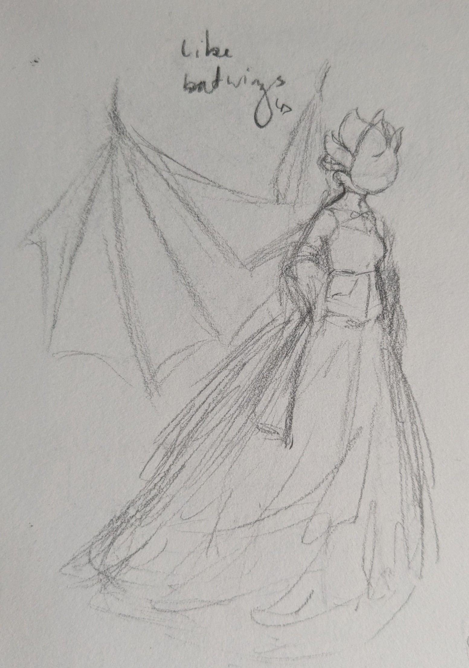
I made this drawing near the start of 2024. It is of a character called Melaina, from a D&D campaign I run with some friends. She is a dragon, but this drawing is my design for her humanoid form. The sketch is not coloured or shaded, but all her clothes and her wings are black. I am particularly proud of the way I drew the skirt of her dress, as it is intended to look like it is made of lots of layers of chiffon, and I think it conveys this effect quite well.
I made this 3D model in 2022, because I wanted to get more proficient in Blender. This was before I joined the BRIT school. It was one of the first 3D models that I made. I used Blender, as previously mentioned, but the way I modelled it was very inefficient. I didn't know about proportional editing yet, so I made it by starting with an icosphere, flattening it down, and moving every single vertex into place one by one. It took a very long time.
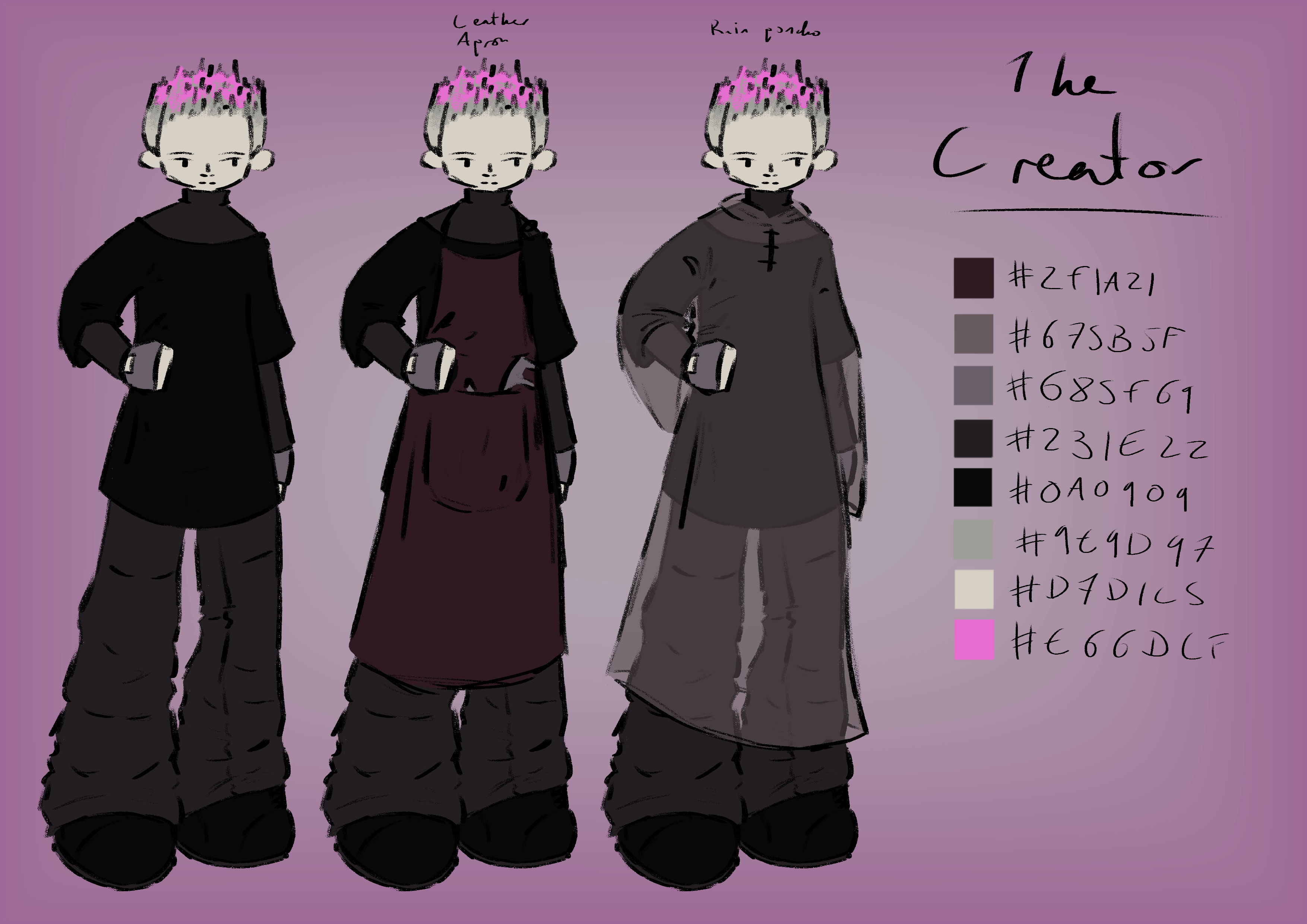
This is a major redesign of the Creator, that I made in the summer of 2024 (you can see her old design here). I redesigned her as I was no longer satisfied with her old design, and I did not feel it fit her personality. My vision of her personality had also changed slightly (previously she was more expressive with her emotions, however now she is more reserved). I also made her clothes more practical in her new design. I did keep some elements similar, for example, her current see-through plastic raincoat is similar to the floaty skirt overlay thing that she used to have.
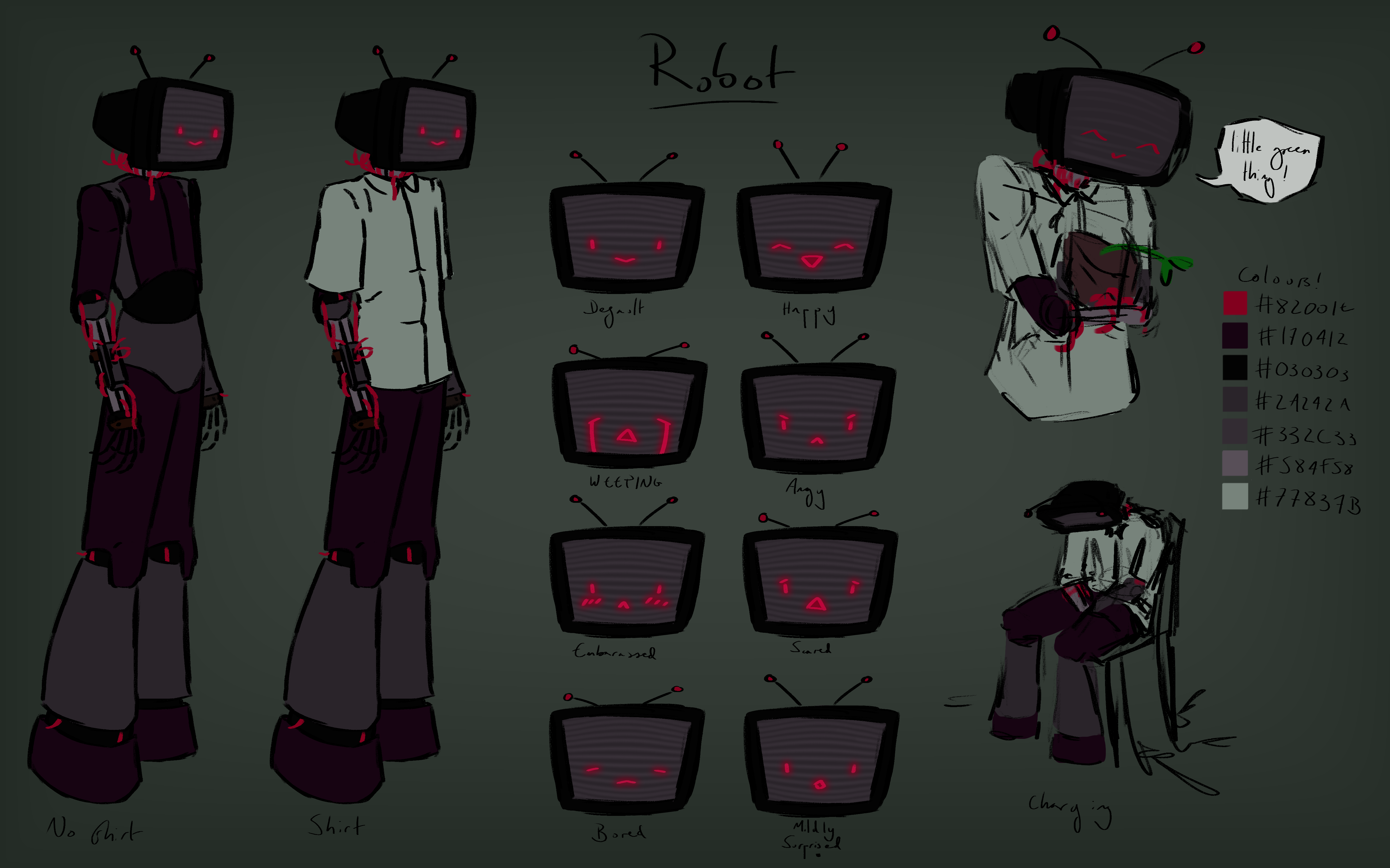
This is a major redesign of the Robot, that I made in the summer of 2024 (you can see its old design here). Its design changed much more than the Creator's design did with the redesign. Unlike the Creator, my vision of its personality remained largely the same, however I was no longer satisfied with its old design. With this design, I wanted to make it appear more obviously a robot, as the main thing that was bothering me about it previously was that it wasn't obviously a robot. I gave it a TV for a head because I wanted it to have an easily visible way to display its emotions.
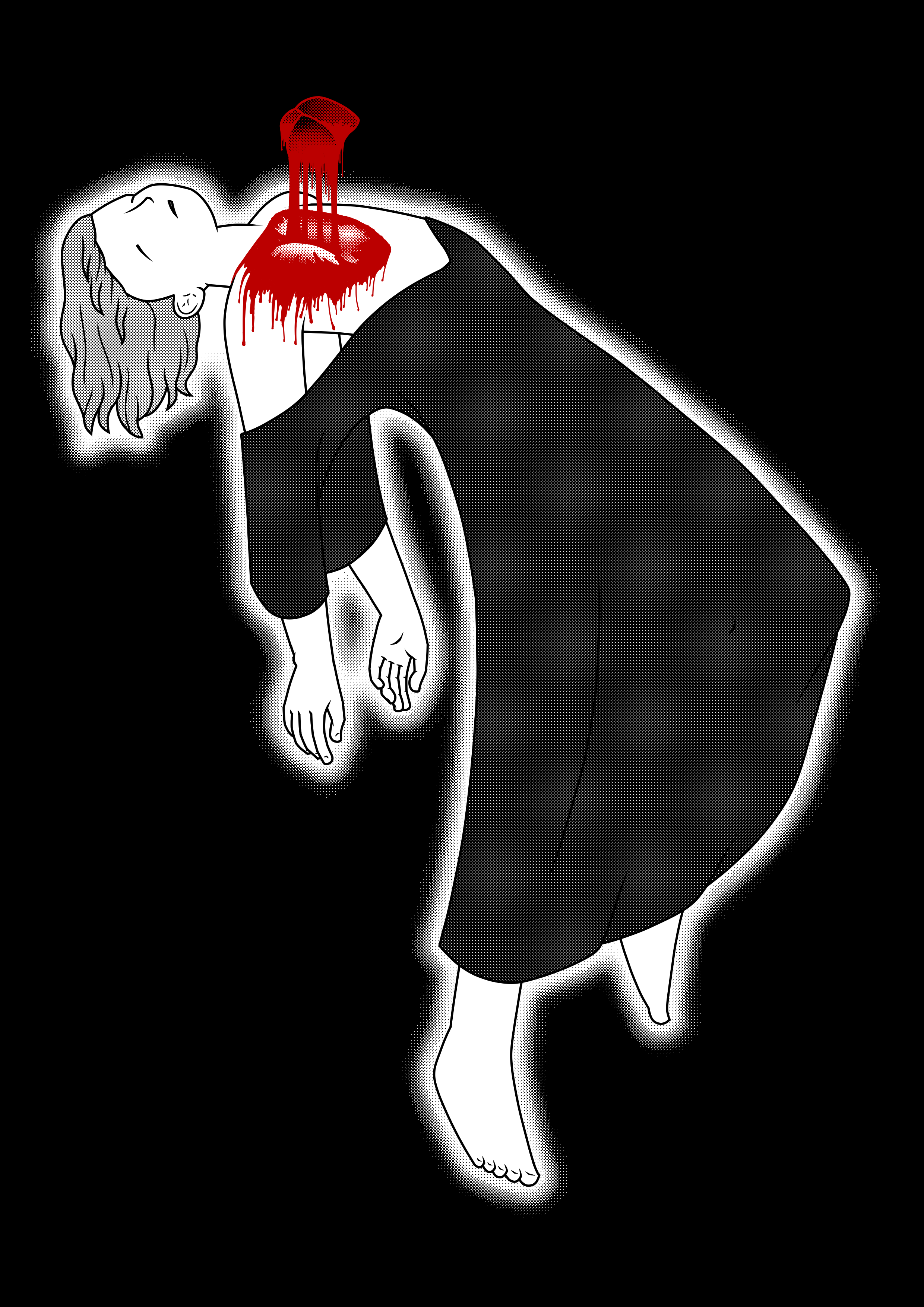
This is an illustration I made in autumn of 2024. I made it because I wanted to experiment with halftone and colour. I also wanted to try and draw a more complicated pose than the poses I normally draw. I used a lot of references for the pose, which I think really paid off in the final illustration. I am particularly proud of the hands, as I usually struggle with hands a lot, and of the hair, as I do not usually draw hair hanging back in this kind of way.
I really like the contrast of the red for the blood and the heart against the rest of the drawing, however, I do think the anatomy of the heart, and the way the blood is dripping could be improved significantly.